Let it be known, the Azn Badger is in no way an authority on Thor.
Like most kids, I dabbled in Norse mythology in my youth; however when it comes to the Marvel version of the Nordic god of thunder, I’m really kind of a newb.
Truth be told, I’ve never read a Thor comic in my life, largely because I could never find an appropriate jumping on point in the character’s expansive continuity.
That being said, while I don’t know Thor all that well, I do consider myself a fairly knowledgeable movie buff; and it’s from that perspective that I’ve decided to throw together this article regarding my impression of the new Thor movie based on it’s recent trailer.
When I first heard that Thor was going to be directed by the great channeler of Billie Shakes himself, Kenneth Branagh; I found myself struck with a crystal clear vision of what to expect:
Shakespeare-ian melodrama, obscenely lavish and over-the-top costume and set designs, and a cameo by the director himself; most likely shirtless and covered in physique enhancing oil.

"I shall now remove my shirt.... For SCIENCE."
Basically, I expected Branagh’s Frankenstein, but with Norse gods and (sadly) no Bobbie D.
Upon viewing the trailer, I can’t help but feel that most of what I expected, good and bad; has come to fruition.
I’m a little disappointed in the fact that, based on the trailer anyway; many of the principle Asgardian (heh heh, “Ass-Guard”) characters are shownwithout their helmets and garb, most likely due to a creative decision along the lines of:
“The audience can’t connect with the characters if their faces are covered by their helmets!”
On that note, costume designs seem appropriately lavish and extravagant, and the sets seem impressively vast as seems to be the norm for any Kenneth Branagh film, however I feel it must be mentioned that the sets that appear to represent Niffelheim (the Norse realm of ice) seem a little anemic compared to the Asgardian ones.
While I’m on the topic of Niffelheim, I’d like to take this opportunity to say that I’m excited to see how the Norse frost giants are depicted in this movie.
In glancing at the imdb for Thor, I happened to notice that Ymir is listed in the cast; which in my mind means we’ll be treated to a bit of a throwdown between him and Thor at some point in the film.
Call me crazy, but the idea of a big fuckin’ Scandinavian dude winging away with a mallet against a mountain-sized man of ice just seems like good watching in my book.
Here’s hoping Mr. Branagh doesn’t fuck it up by having the 2 of them give a soliloquy before initiating a “gentleman’s duel.”

...Or fuck it up by having Ymir look any less cool than THIS.
Sorry, I’m not much for Shakespeare…
Getting back to the movie, I don’t know if maybe the intention was that the Niffelheim sequence in the film was meant to be intentionally “stagy” or theatrical, but at this point the set just looks kind of cheap.
Like, Jerry Bruckheimer King Arthur cheap.

Pictured: A still from the climactic battle sequence of King Arthur.
Moving on, from what I can tell, the cast for the film seems fairly solid.
Casting Sir Anthony Hopkins (that’s right, I call him “sir.” The question is: Why the fuck don’t you?) as Odin was pretty much a no-brainer.
The man has a voice, and gruff old man presence about him that makes him perfect for pretty much any elder god in all of mythology.
Curiously enough, both the actors for Loki and Thor are strangely unknown to me.
Tom Hiddleston, at least physically anyway, seems to fill Loki’s shoes rather well.
When I picture Loki, I picture a frail, weasely motherfucker that does pretty much all of his fighting with his words and his voice.
That is to say, while Hiddleston seems to look the part at this point; the effectiveness of his performance will likely be determined by the strength of the script… which will most likely suck ass.
Chris Hemsworth as Thor, seems to be a bit of a gamble; but a fairly well justified one.
Remember when Daredevil came out, and people were up in arms aboutMichael Clarke Duncan being cast as the Kingpin?
People were upset that a black man was cast for a white character, however they did so without taking into account the fact that the Kingpin, in the comics anyway; was supposed to be built like a brick-shit house.
Can you name any legitimately talented actors, black or white; with a physique that could meet that description as well as Michael Clarke Duncan?
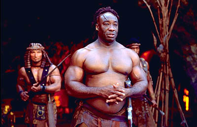
BRICK. SHIT. HOUSE.
Didn’t think so.
My point is, while Chris Hemsworth is pretty much an unknown in Hollywood; I honestly don’t know of many actors that can pull off the whole “musclebound viking look.”

I said "actors." Yes, he probably would fill the role just fine though.
And don’t say “what about Brad Pitt?” because I honestly don’t think he’d be a good choice given that he’d probably put too much swagger into his Thor.
Stupid Brad Pitt, bein’ all sexy n’shit…
The last thing I’d like to say about the cast of Thor, is that I don’t know anything about the nature of her character in the comics or in the film, but the way they showed her in the trailer, Natalie Portman seems like she’s just there.

Nonetheless, that tends to count for a lot when you look like this.
Seriously, I don’t know if the marketing guys over at Marvel are to blame, but the way she’s treated in the trailer suggests that this may very well be a case of “Tree #3 as played by Natalie Portman.”
Maybe it’s just the fact that she’s the only one in the cast that doesn’t have a flashy and heavily ornamented suit of Scandinavian power armor, or the fact that her schedule was very likely crowded with, y’know; good movies she had to act in, but seriously; if it wasn’t Natalie Portman, I don’t think any of us would’ve even noticed her character in the trailer.
In closing, Thor looks to be pretty much what I expected.
I don’t expect an epic, fast-paced, or even all that entertaining an experience out of it, but it’s a Marvel movie, it has superheroes hitting each other, and yes; that is enough to make me go see it.
I want to see the Destroyer armor blow up cars.
I want to see how many creative ways a big hammer can be used to kill frost giants.
I want to see if Tadanobu Asano AKA the Brad Pitt/Johnny Depp of Japan, can make a name for himself in American films.
But most of all, I want to hurry up and skip this pile of ass so we can get to the good shit like Captain America and The Avengers.
Fanboy as I am, it’s more than likely that all of the above will end up sucking balls though.
Though Thor is the only one that can boast the possibility of a random shirtless Kenneth Branagh.

"I must do this scene, SHIRTLESS! The integrity of the film demands it!"